Why Your Website Should Be Mobile-Friendly

There are so many research stats, and surveys out there we don’t want to bore you with the details. The conclusion of them all, from around 2015 onwards, is that mobile is king. Whatever country, and whatever year, since 2015, the research is based on, the outcome is that over 50% of websites are accessed by mobile devices. Some research shows this is as high as 60%. And they all agree the trend is increasing.
There is more research that shows the amount of time we spend on our phones (terrifying!) and how frequently we do that (even more terrifying!).
It is no longer an option to have a mobile-friendly website. It is a given.
What makes a website mobile-friendly?
In basic terms, it means that the display and format of your website can be seen clearly on a smaller screen. A mobile-friendly website is known as “responsive” as it automatically formats to suit the device that is being used to view it.
Features of a mobile-friendly website
- Larger, easier-to-read text
- Mobile-friendly navigation
- Touch-friendly buttons and page elements
- Faster download speed
What benefits are there to a mobile-friendly website?
A mobile-friendly website will give a better user experience, and you are likely to get the action you want from your visitors.
But more than that, Google will love it, and your website will have improved search visibility. Being mobile-friendly is considered important by Google, and will move you up the rankings, to perhaps get to that ever-desired first page.
Do I really need to bother? Surely just having a website is enough?
This article started by explaining that the majority of people who search and find your website will be doing so on a mobile device. It is so important that they have a great experience when they find it.
We are living in the age of instant gratification – and options. If your website doesn’t load, if it is impossible to read, if it is hard to find the right menu option then people will just move on – to your competitor!
Nobody wants to wait 5 minutes for a menu to load, and then have to cope with teeny-tiny writing, and only seeing half the page width.
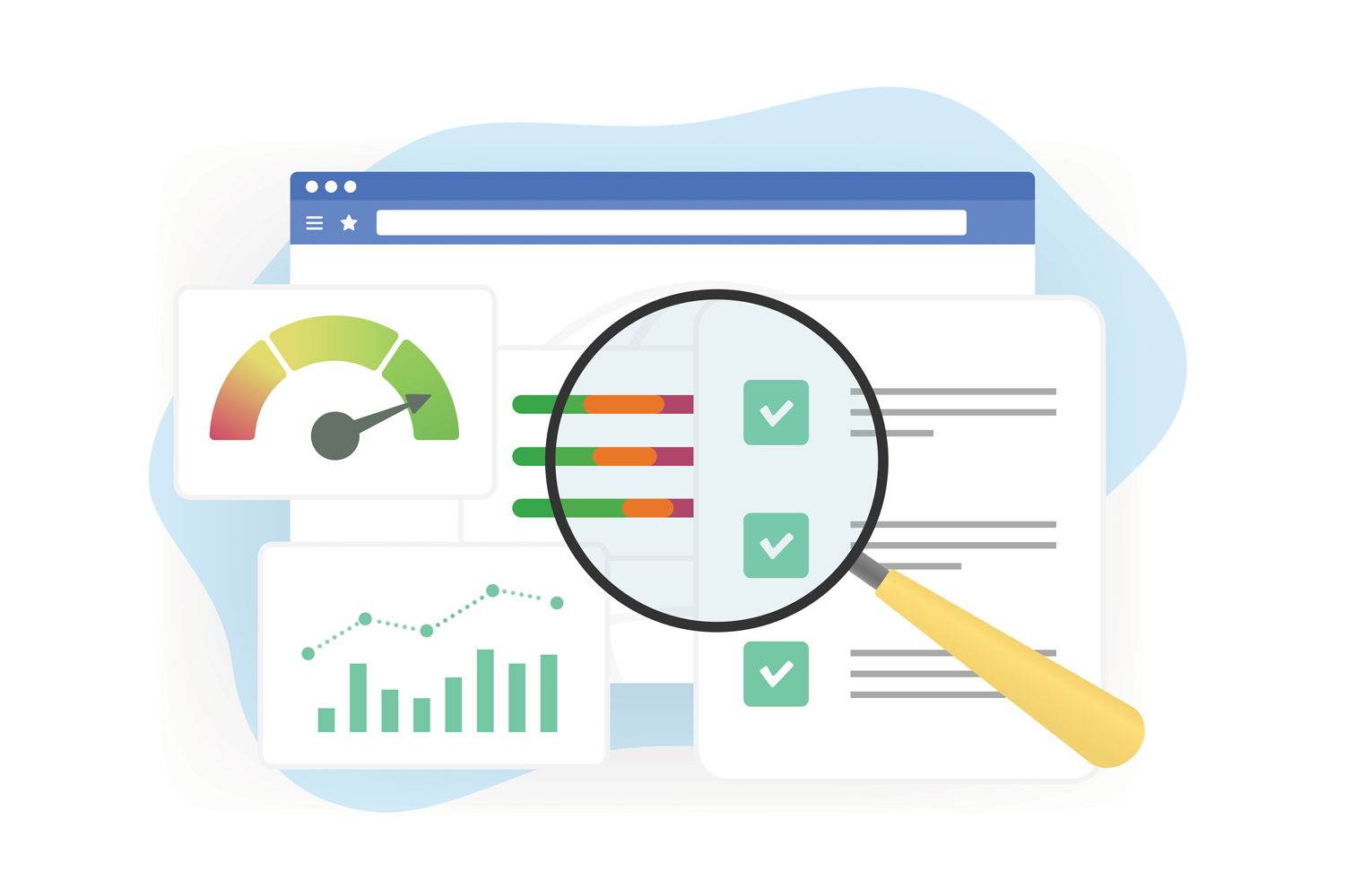
Not sure if your website is mobile-friendly?
To check how mobile-friendly your site is you can do several things:
- Look at it on a mobile. Seriously, the easiest way to see how it looks and performs
- Use the free Google tool to access it https://search.google.com/test/mobile-friendly
- Ask us. We would be happy to do a quick audit for you and assess how mobile-friendly it is, and what needs to change
How can I improve my website for mobile use?
It’s not easy. You can create a separate website for mobile use, or alter your existing website to make sure that it can “translate” to mobile.
If your website has been well-designed and well-built, it can be as simple as updating page templates. In other cases, it may require significant development.
Here to help!
If you are unsure if your website is mobile-friendly, or as mobile-friendly as it should be, just give us a call. We can check it out, and advise you on how best to make the changes that are needed. Always here to help!