Is Your Brand Working? How Graphic Design and Visual Hierarchy Drive Website Trust
Where do potential customers first see you? The high street? Insta? FB? Pinterest? Your website? A leaflet? A poster? A van?
Depending on your business, it could be any number of places. And whether your website is the first place they discover you, or the place they go to learn more and verify you, it is vital that what they see is consistent.
Understanding the relationship between branding, graphic design, and visual hierarchy is the first step toward building a high-performing online presence.
Definition of a Brand and what it includes
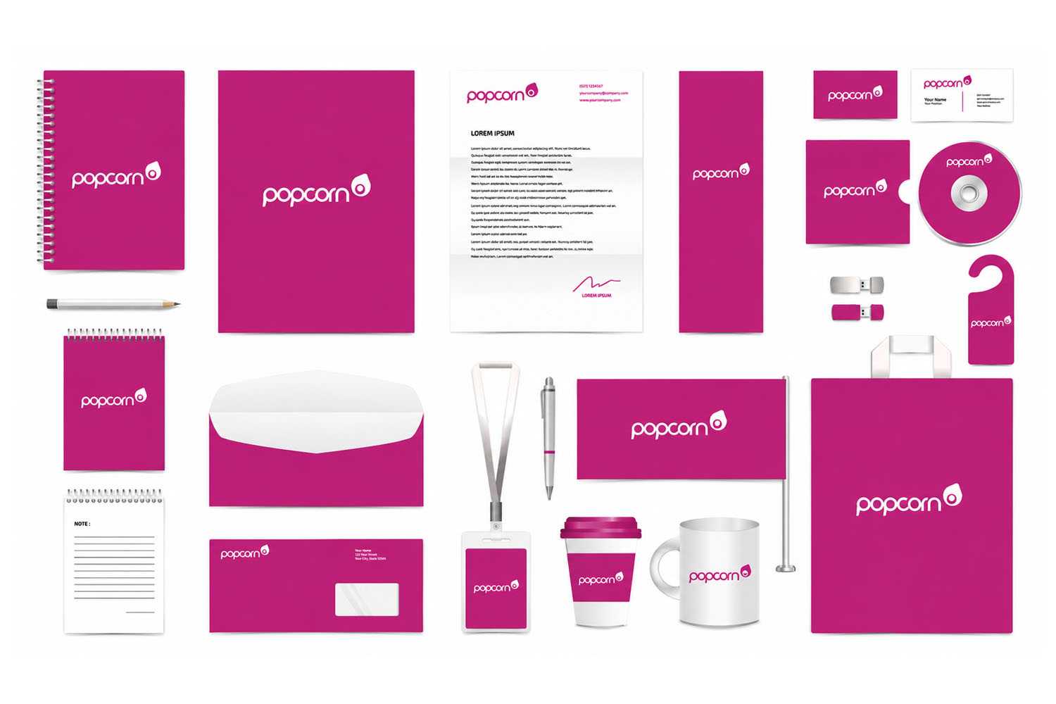
A brand is much more than just a logo. It is the sum of all the impressions a customer has of your business. It represents your values, your message and your USP. A complete brand identity includes your colour palette, typography, tone of voice and even the style of imagery you use. When these elements work in partnership, they create a cohesive identity that makes your business instantly recognisable and differentiates you from the competition.
You should have a brand identity kit, and everything you present, regardless of print, digital or forum, should match this branding.
What is Graphic Design?
Graphic design is the craft of creating visual content to communicate messages. In the context of your website, it is the professional application of your brand identity to a digital space. It involves the strategic use of layout, space and images to ensure that your site is not only aesthetically pleasing but also functional. Professional graphic design ensures your website looks established and organised, not amateur.
What is visual hierarchy?
Visual hierarchy is the arrangement of elements that implies importance. It is a roadmap for the user’s eye. By using different sizes, colours and placements, we can guide a visitor through your website in a specific order. The goal is to ensure the most important information, such as your Call to Action, stands out immediately. Without a clear hierarchy, a website becomes a “wall of text” or a jumble of images, leaving the user befuddled.
How does this Graphic Design and Visual Hierarchy drive trust in your website?
Trust is the foundation of every online transaction. When a website is professionally designed with a clear visual hierarchy, it signals to the user that you are a credible and reliable business.
- Professionalism: High-quality imagery and consistent design show that you care about detail.
- Ease of Use: A logical structure that limits clicks allows users to find what they want quickly, reducing frustration.
- Clarity: When a user can easily navigate your site, they feel in control, which builds confidence in your brand.
The Damage of a DIY Approach to Branding
While DIY design tools are popular, they often lack the nuance of a professional brand strategy. An amateur approach to your visual identity can lead to inconsistent branding, undermining your brand’s value. Common pitfalls include using poor-quality stock images or ignoring the core values that make your business unique, both of which can diminish trust. If your branding looks like a generic “template,” it fails to communicate your message and can make your business appear temporary or unorganised.
Examples of companies that do it well
The most successful websites often feel the simplest. Brands like Apple or Airbnb are masters of visual hierarchy. They use vast amounts of “white space” to ensure your focus is exactly where they want it. Their branding is woven into the design, using consistent typography and high-quality imagery to create an emotional connection with the audience. You know exactly what to do next because the design guides you effortlessly there.
And who would have thought that an image of a piece of fruit would mean so much to so many people and be related to the work of technology and innovation?
Next steps
Is your current website working for you or against you? If you would like to learn how to improve your visual hierarchy or understand how a professional brand refresh could increase your leads and sales, give us a shout.
Contact the team at Popcorn Web Design today to find out how we can direct your website visitors through to your shop and maximise your conversions.